
Let’s be real, no amount of strategy, fancy triggers, or clever copy will matter if your page drops the ball when it counts.
During the Black Friday / Cyber Monday frenzy, high-intent traffic is dangerously impatient. A technical glitch or a confusing user experience can be a catastrophic, conversion-killing event that sends your customer straight to a competitor.
This is where you make sure the machine works flawlessly under pressure.
1. Speed Is Not a Feature: It Is the Foundation
Page speed is the single most important technical factor for conversion. A slow site kills excitement, breaks trust, and costs you a fortune. The data is unforgiving:
- A site that loads in 1 second has an e-commerce conversion rate 2.5x higher than a site that loads in 5 seconds.
- For B2B/SaaS, that gap is even wider: a 3x to 5x higher conversion rate.
- Even a tiny 0.1-second improvement in load time can boost your conversions by 8-10%.
The conversion penalty for slow load times is exponentially worse on mobile. A 5-second load on a desktop is a disaster; on a less reliable 5G connection, it’s a total failure. Research shows 53% of mobile visits are abandoned if a page takes more than three seconds to load.
Let us say that again: A page that takes 5 seconds to load on mobile will convert almost no one. Page speed optimization is mobile optimization. They are the same #1 technical priority.
Your job is to be ruthless. Aggressively compress every hero image and visual. Use a Content Delivery Network (CDN) to handle the traffic surge and leverage browser caching. Every millisecond you shave off is money in the bank.
2. The Mobile-First Mandate: Design for the Thumb
As we established, mobile isn’t just a channel; it’s the primary channel. “Mobile-first” isn’t just about a responsive design; it’s about designing for the “thumb zone.”
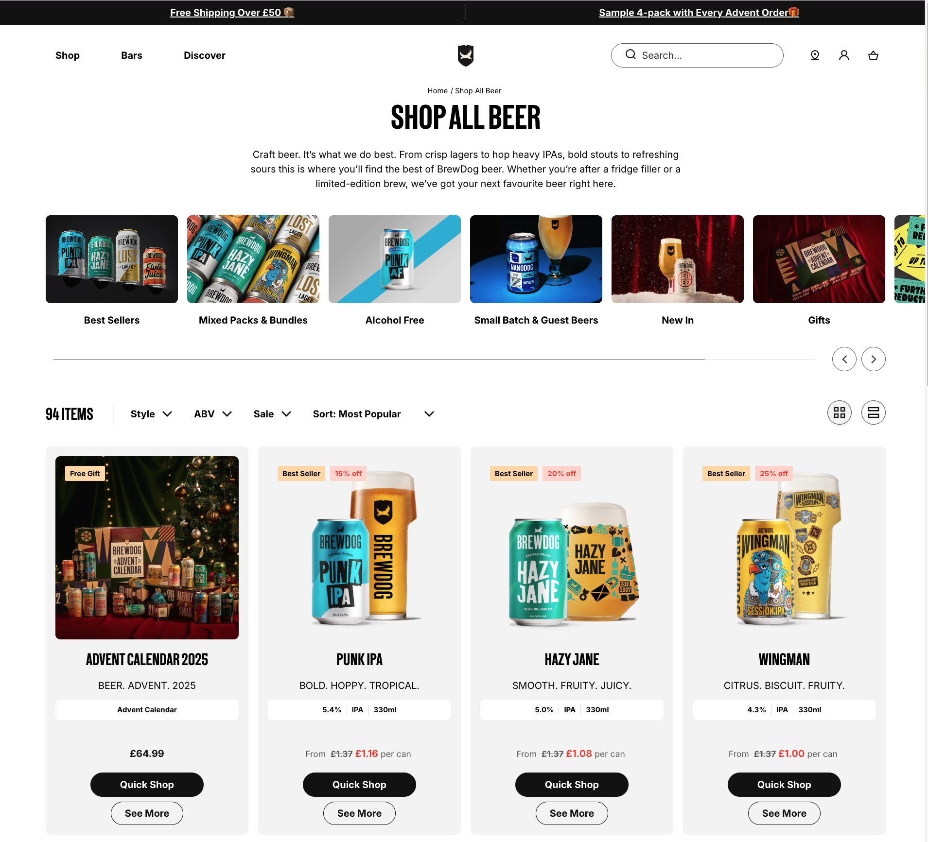
- Make CTAs unmissable. Buttons must be large, satisfying to tap, and have enough negative space to eliminate “fat-finger” errors.
- Embrace the scroll. Use a simple, single-column layout with large, legible fonts. Stop trying to cram everything “above the fold”.
- Eliminate the Keyboard, Eliminate Friction. Every time a user has to type, you risk losing them. Use tools like postcode lookups for addresses and prominent one-click payment options like Apple Pay to bypass the keyboard entirely.
On desktop, a user might forgive a confusing layout. On mobile, they will not. The goal is to create an effortless, linear path from interest to purchase; one that can survive a real-world interruption and still feel perfectly intuitive upon return.
3. Weaponise Trust: Disarm Anxiety at the Moment of Truth
At the moment of purchase, your customer’s anxiety is at its absolute peak. Trust signals are not just decorative badges; they are strategic tools designed to disarm specific fears right before they cause cart abandonment.
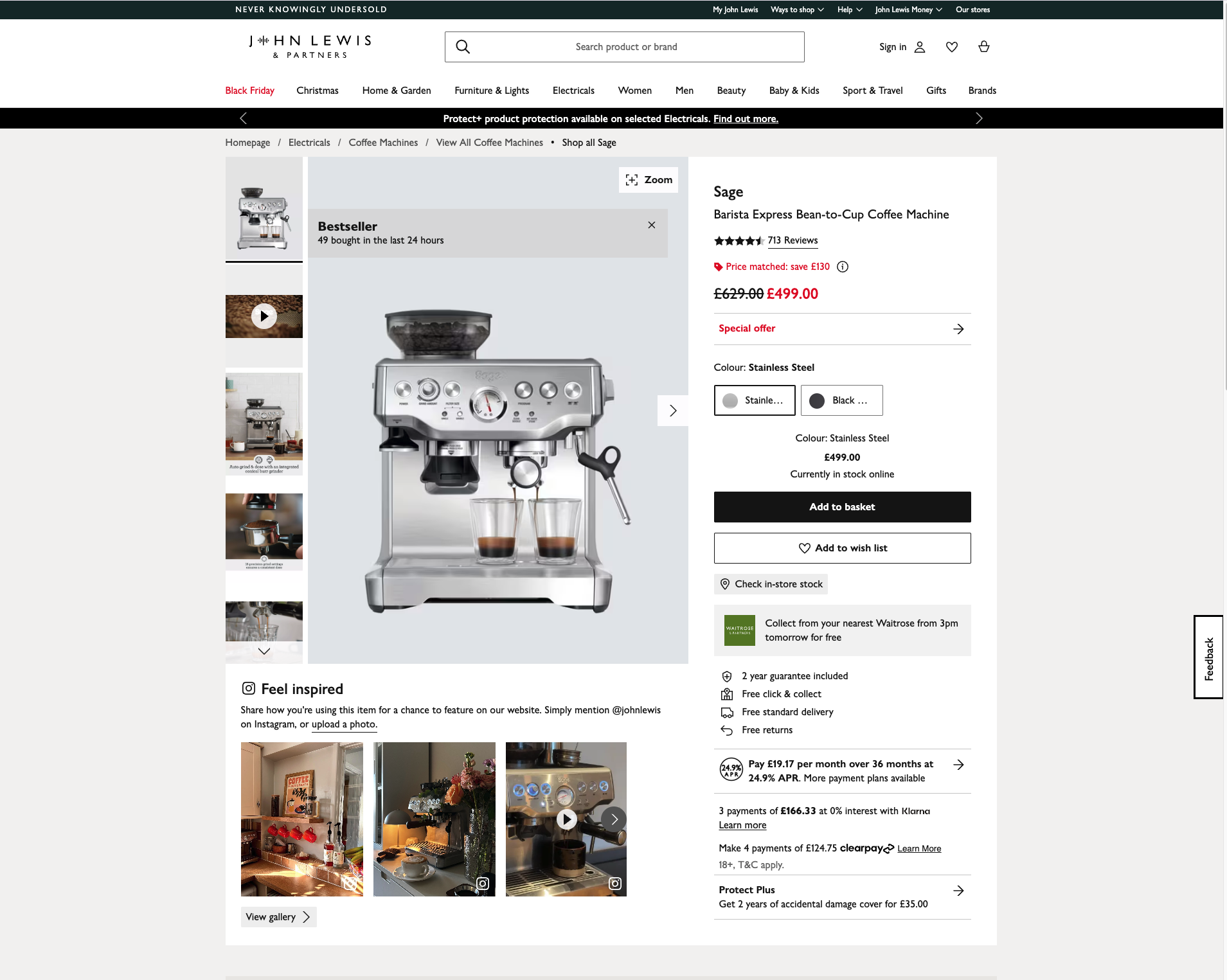
This is especially important for high-ticket items as opposed to impulse purchases. The more people spend, the more they want to be reassured.
Deploy them based on the question the user is asking themselves:
| The Anxiety | The Solution | Placement |
| “Is my credit card information safe here?” | Security & SSL Seals (e.g., Norton, McAfee, DigiCert) | These belong at the point of maximum friction: directly within the checkout form, adjacent to the credit card and CVV fields. They provide a final, critical reassurance that the connection is encrypted right now. |
| “Is this a legitimate business that accepts my payment?” | Payment Provider Logos (Visa, Mastercard, PayPal, Apple Pay) | Display these logos clearly below your primary call to action on the landing page and again in the footer of the checkout page. This signals legitimacy and informs users of their options upfront. |
| “What if I regret this purchase or it does not work out?” | Guarantee & Confidence Badges (“Free Returns,” “30-Day Money-Back Guarantee,” “Satisfaction Guaranteed”) | These are your deal-closers. They reduce the perceived risk of the purchase itself. Position them directly beneath the “Add to Cart” or “Claim Offer” button to overcome final hesitation. |
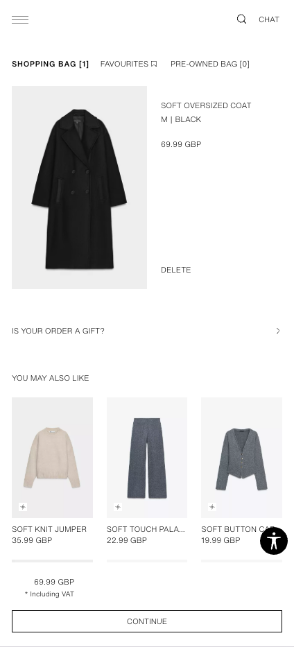
4. The Frictionless Checkout: Your Final Conversion Point
The checkout flow is where most sales are lost to pure frustration. Your goal is to remove every single reason to hesitate.
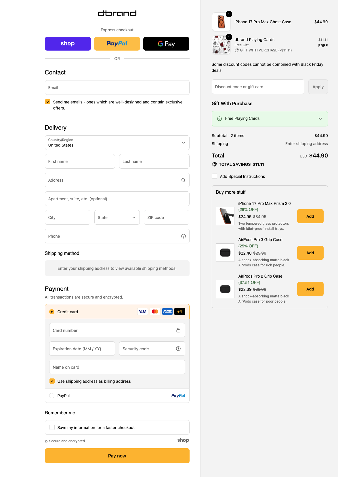
Guest Checkout is non-negotiable
Let them check out as a guest. Period. Forcing users to “create an account” before a purchase is the fastest way to lose them. You can always ask them to create an account on the “Thank You” page, after you have their money.
Minimize Your Form Fields
Be ruthless. Do you really need their phone number right now? Or their company name? Only ask for what is absolutely essential to process payment and ship the product. Use a simple checkbox for “billing address is same as shipping.”
Show Progress Indicators
A visual progress bar (“Step 1: Shipping > Step 2: Payment”) reduces anxiety by showing the user exactly where they are and how close they are to being done.
Offer Mobile Wallets & BNPL
On mobile, nobody wants to type in a 16-digit credit card number. Feature one-click options like Apple Pay, Google Pay, and PayPal prominently. And make sure Buy Now, Pay Later options like Klarna or Afterpay are presented as a clear payment choice, not hidden away.
Putting it all together
When all of this comes together, speed, clarity, trust, frictionless flow, ou end up with a page that doesn’t just survive Black Friday traffic… it thrives in it.
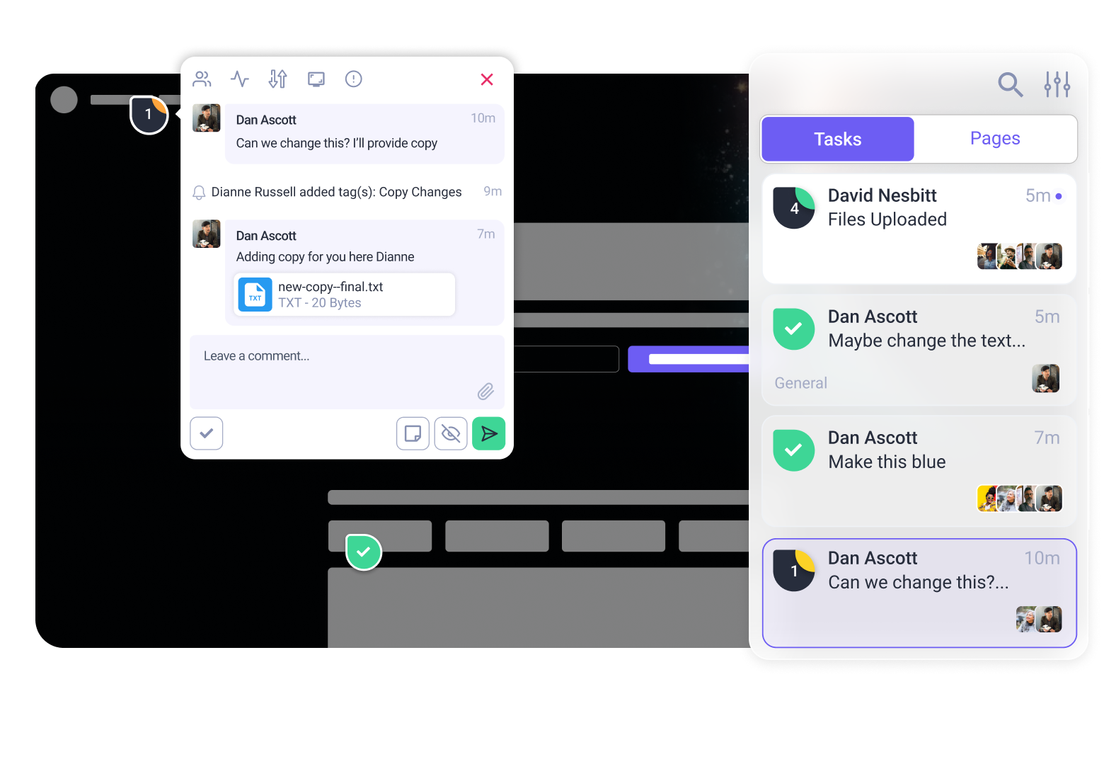
And the best part? You don’t have to guess where your page is strong and where it’s quietly leaking conversions. If you want a second pair of eyes (or six), invite the Inner Circle in for a quick page review. They’ll point out the gaps you might have stopped noticing and give you a clear path to tighten things up before the rush hits.
A smoother page, a calmer launch, and a whole lot more customers actually making it to the finish line. You’ve got this, and your future self will definitely thank you. Click here to give the InnerCircle a spin on your pages.